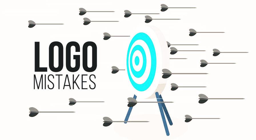
Common Logo Design Mistakes and How to Avoid Them
Your logo is often the first thing people notice about your brand. Whether it appears on your website, a product label, or a social media profile, it’s your visual handshake with the world. But what happens when that first impression isn’t a good one? Unfortunately, many businesses fall into logo design traps that hurt their brand image rather than help it.
Designing a logo may seem simple, but it takes more than playing with fonts and icons. Let’s walk through the most common logo design mistakes and how to avoid them, so your brand makes a confident, lasting impression.
Overcomplicating the Design
One of the most frequent missteps in logo design is overcomplication. A busy or overly detailed logo might look impressive in theory, but in practice, it fails. Complex logos lose clarity when scaled down and can overwhelm the viewer with unnecessary elements.
Simplicity isn’t boring—it’s strategic. Clean, uncluttered logos are easier to recognize and remember. Think of the Nike swoosh or the Apple logo—both are incredibly simple but instantly recognizable worldwide.
If you’re working with an online logo design company, prioritize clarity. Make sure your final design works as well on a business card as it does on a billboard.
Choosing the Wrong Font
Fonts communicate more than just words—they convey mood, style, and professionalism. A casual or cartoonish font might be great for a toy company, but it’s probably a poor fit for a financial consulting brand.
A mismatch between font and brand tone is a silent killer. It confuses your audience and dilutes your credibility.
To avoid this mistake, choose typography that aligns with your business’s core values. Serif fonts suggest tradition and reliability, while sans-serif fonts lean toward modernity and clarity. And always, always avoid trendy fonts that are hard to read or gimmicky.
Poor Color Choices
Color isn’t just decorative—it’s psychological. Different colors evoke different emotions. For example:
-
Blue = trust, calm, and professionalism
-
Red = passion, urgency, excitement
-
Green = growth, health, nature
Using too many colors or choosing ones that clash can weaken your brand identity. A loud palette may confuse your message or come off as amateurish.
Stick to 2–3 complementary colors. Always test your logo in black and white to ensure it retains impact without color. Remember, color should enhance your logo, not carry it.
Following Trends Too Closely
Design trends come and go. What’s hot today might look dated tomorrow. While it’s tempting to hop on the latest design wave, logos built on trends can age poorly.
You want your logo to last. That means focusing on timeless elements that reflect your brand, not fleeting styles. Ask yourself: Will this still represent my brand five or ten years from now?
Create for longevity, not likes.
Lack of Versatility
A logo that only looks good on your website but fails on packaging, business cards, or social media headers is a missed opportunity. Great logos are flexible. They adapt across platforms, maintain clarity at any size, and look just as good in monochrome as in full color.
To make your logo versatile:
-
Use vector formats (.AI, .SVG, .EPS)
-
Ensure it’s legible in small sizes
-
Test it across dark and light backgrounds
A versatile logo saves you headaches in the long run and keeps your branding consistent wherever it appears.
Ignoring Competitor Research
Failing to research your competitors can lead to two big problems: looking too similar or not standing out enough. Your logo should place you confidently within your niche while maintaining originality.
Before designing, study your industry’s visual language. What fonts, colors, and shapes are common? What can you do differently while still being recognizable?
Understanding the landscape allows you to design a logo that resonates with your audience but still turns heads.
Skipping Professional Help When It’s Needed
We all love a good DIY project, but your logo is not the place to cut corners. Free logo makers and quick design apps may seem convenient, but they often result in generic or low-quality designs that don’t reflect the value your business offers.
If your budget allows, invest in a professional designer or agency. The difference shows. Professionals understand the principles of design, branding psychology, and how to align visuals with your business goals.
When done right, your logo becomes an asset, not just a placeholder.
Lack of Emotional Connection
Design isn’t just logic—it’s emotion. A good logo makes people feel something, whether it’s excitement, trust, curiosity, or warmth. If your logo feels sterile or disconnected, it won’t resonate.
That emotional pull is what transforms a logo into a symbol of loyalty. Think of how people feel about logos like Coca-Cola, Disney, or Tesla. The logo isn’t just visual—it carries a narrative.
When designing your logo, think beyond the visual. What story does it tell? What emotion should it evoke? Build from there.
Final Thoughts
Logo design isn’t about artistic flair—it’s about strategic storytelling. A strong logo builds trust, conveys identity, and invites customers to connect with your brand. By avoiding the common mistakes above, you ensure your logo isn’t just attractive—it’s effective.
In a marketplace full of choices, trust can be your most powerful differentiator. And your logo? It’s your brand’s first promise. Make it count.